It would take way too much time to scan them manually, so I used
PRAW to mine them. The basic algorithm was:
- Get all posts for a day
- If a post's title contains a candidate's name, increment that candidate's counter for the day
- Log number of mentions for each candidate for each day and move to the next day
I ran this from May 16, 2015 to November 15, 2016, so roughly the 18-month election cycle and a short bit after it.
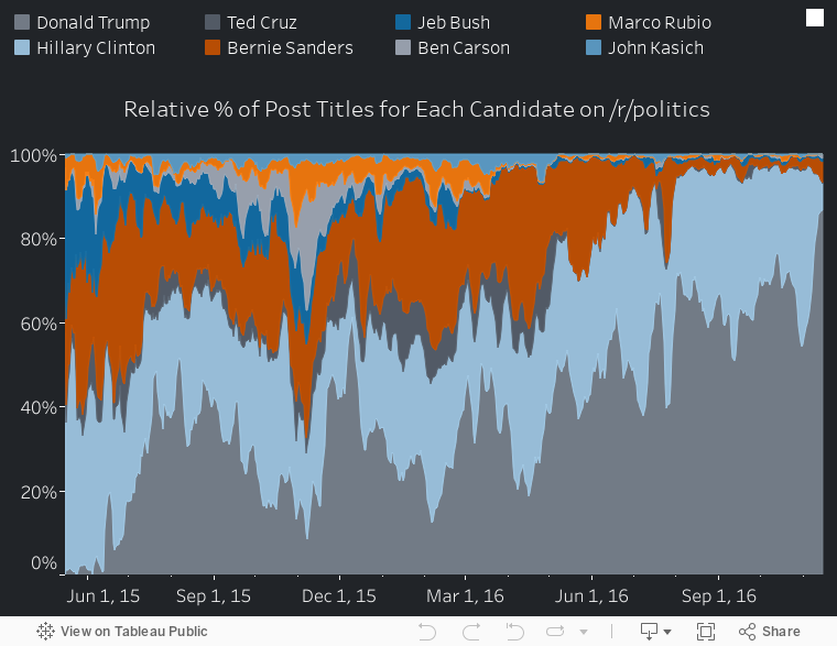
The static image at the top is the relative share of the mentions that each candidate received with a 5-day filter applied to the mentions. Note that this isn't the % of all posts...this is the % of all candidate mentions in post titles that went to each candidate.
It's nice to have context for everything, so I put together a tableau visualization that has hover help explaining some key events in the election cycle that I think explain some of the spikes. It is here (note tableau has issues on mobile for me...if it sucks for you, scroll down and there are static images with similar info):
Same thing but split by candidate:
The obvious pieces are that Clinton was steady throughout, Trump really took over starting in the spring of 2016, and he cannibalized everyone else as they dropped out during that period. It's maybe interesting that negative stories seem to dominate. For example, the following all seem like they led to spikes:
- CNN cannot confirm Carson's stories about his past
- FBI makes announcements about Hillary's e-mail investigation
- Trump says controversial things (POW's aren't war heroes, grab them by the pussy, etc.)
And a gif combining them:
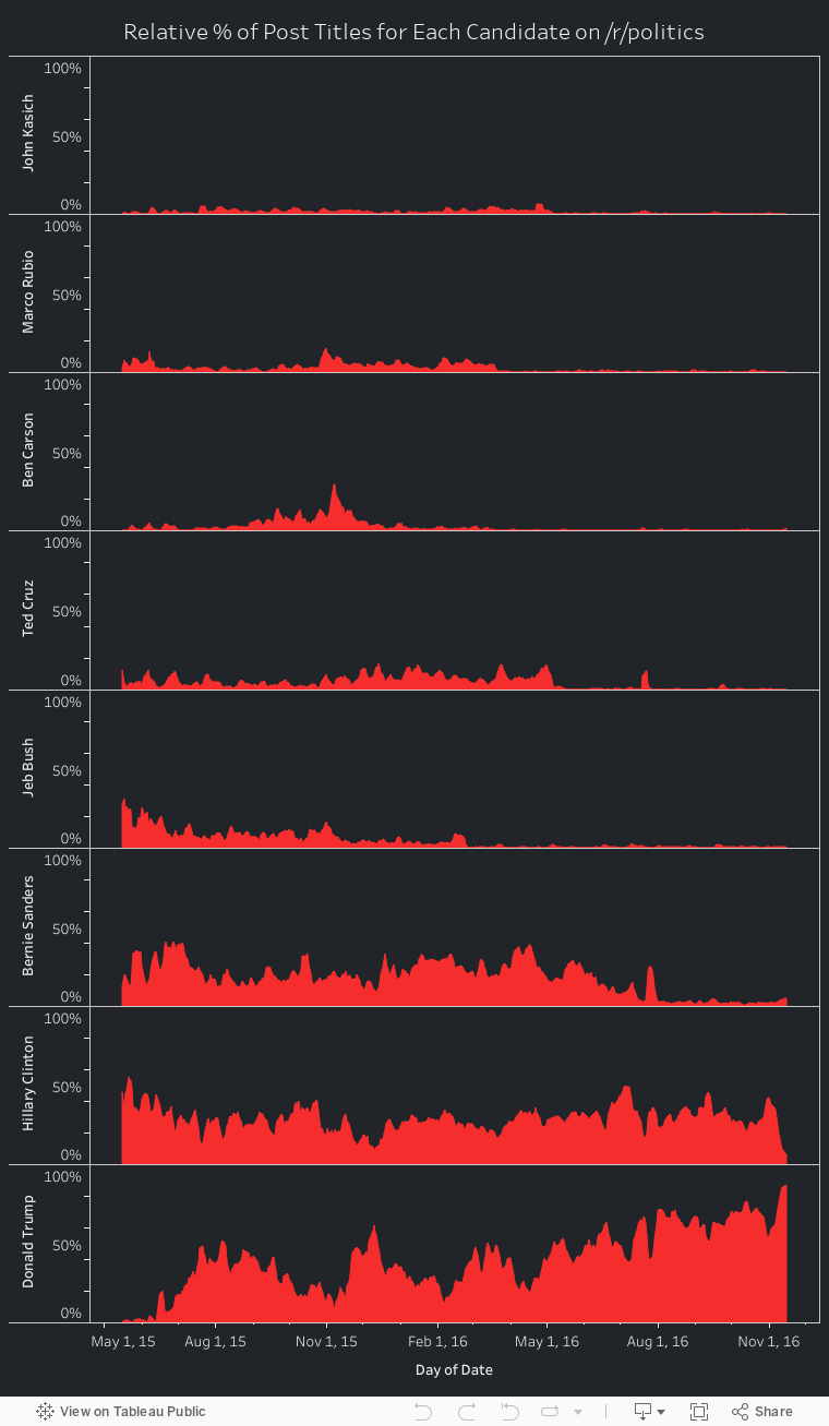
As you filter more, you can clearly see Trump dominating everyone as it goes. Another way to look at this that might be easier for people is to see each candidate as the base, so I've included those plots (with 5-day windows) here:
 |
| Bush |
 |
| Carson |
 |
| Clinton |
 |
| Cruz |
 |
| Kasich |
 |
| Rubio |
 |
| Sanders |
 |
| Trump |
This is the view that makes it easiest to see each candidate dropping out of the race. Check out the GOP candidates in the spring of 2016, Sanders in June, etc. You can also see interesting bits like Cruz being flat and then spiking massively during the Republican National Convention (near July 20, 2016), a similar spike for the Democratic National Convention for Bernie (near July 25, 2016), etc.
Biases in the data
There are a lot of ways this can miss things. A couple of obvious ones though:
- Clinton and Bush both share a last name with famous politicians, so there are a few false positives for them
- Trump's kids are famous and his name is a word, so there are a few false positives for him
I'm guessing these don't play a huge role, and the fact that Bush drops out after he dropped out of the election, Trump's major controversial statements show spikes within a couple of days, etc. means this passes simple sanity checks.
Scanning code can be found here:
https://github.com/rhamner/rpolitics_candidatepopularity


0 comments:
Post a Comment